2025
Case Study
TL:DR? Check Prototype
The present app is like Blue Line on a Monday morning - Slow!
Agar Delhi dil hai, toh Delhi metro uski dhadkan! But does the current app of Delhi Metro match this heartbeat?
Navigating a metro app should be effortless, but the existing Delhi Metro app have usability challenges that makes a user's journey planning and ticketing difficult. Out of 65.1K total reviews, the app currently has an average rating of just 3.2 stars. I attached some of them;
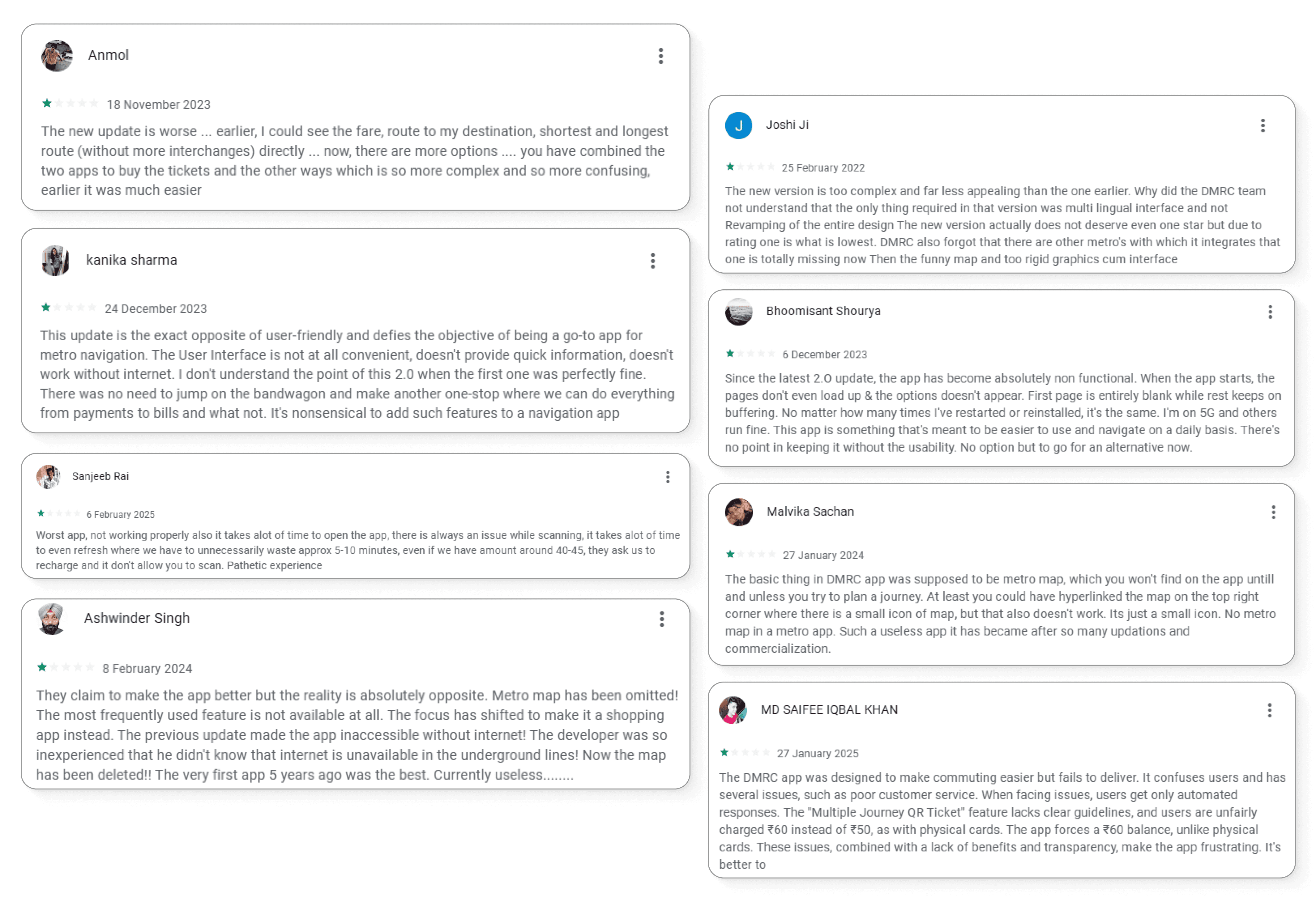
The present app and its problems
I went through the DMRC Momentum 2.0 (Delhi Metro) app. Based on my observations and general user feedback, here are some of the major problems:
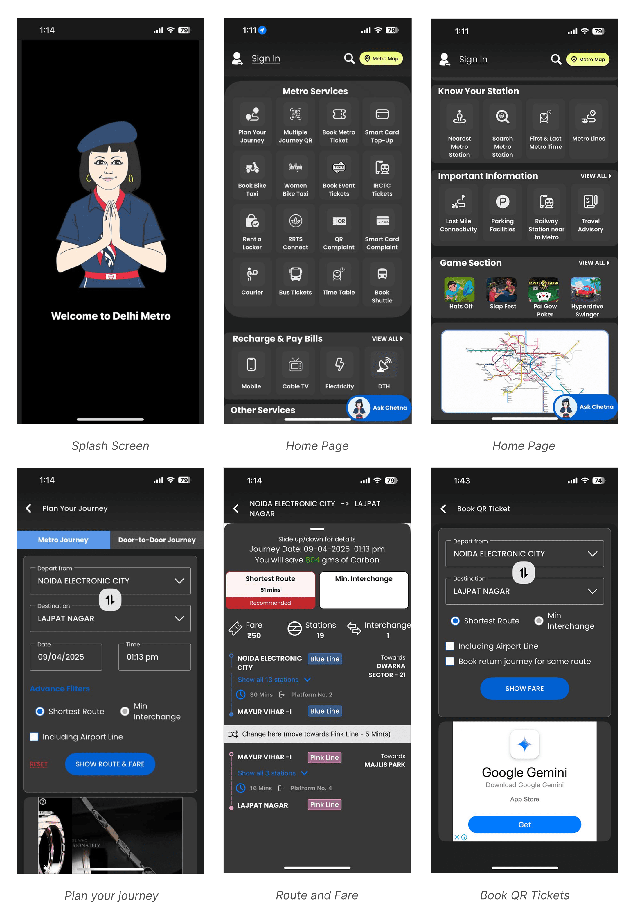
Outdated Splash Screen: The intro screen with the cartoon figure lacks modern visual appeal. It fails to create a strong first impression.
Overcrowded Home Screen: Too many action buttons are presented before the user - at once! No prioritization of essential vs. secondary actions.
Accessibility Issues: The app uses a dark theme but some elements (like labels, checkboxes, and dropdowns) lacks contrast.
Advertisement Placement: Ads like the Google Gemini banner feel intrusive, that too on a transactional page like ticket booking.
Inconsistent Icons: The icons in the app lack consistency, some are outlined, others are filled with solid color.
Overuse of Grays: Most backgrounds, cards, and buttons sit in the same dull gray color which may create a visual fatigue. It also creates a monotony.
Now, let's dive into the Redesign!
I focused on a user-first approach, ensuring a simple and visually appealing experience. Here's how I attempted the redesign:
Research
Analyzed feature requirements for the app;
Must have features: Top-up/Recharge, Route Planner, QR Tickets, SOS and Safety, Complaints, Offline Map.
Enhancement features: Parking availability, Know your Station, Metro Service Status, Smart notifications and Alerts.Studied some best practices for transit apps from 'Mobbin' and 'Refero'.
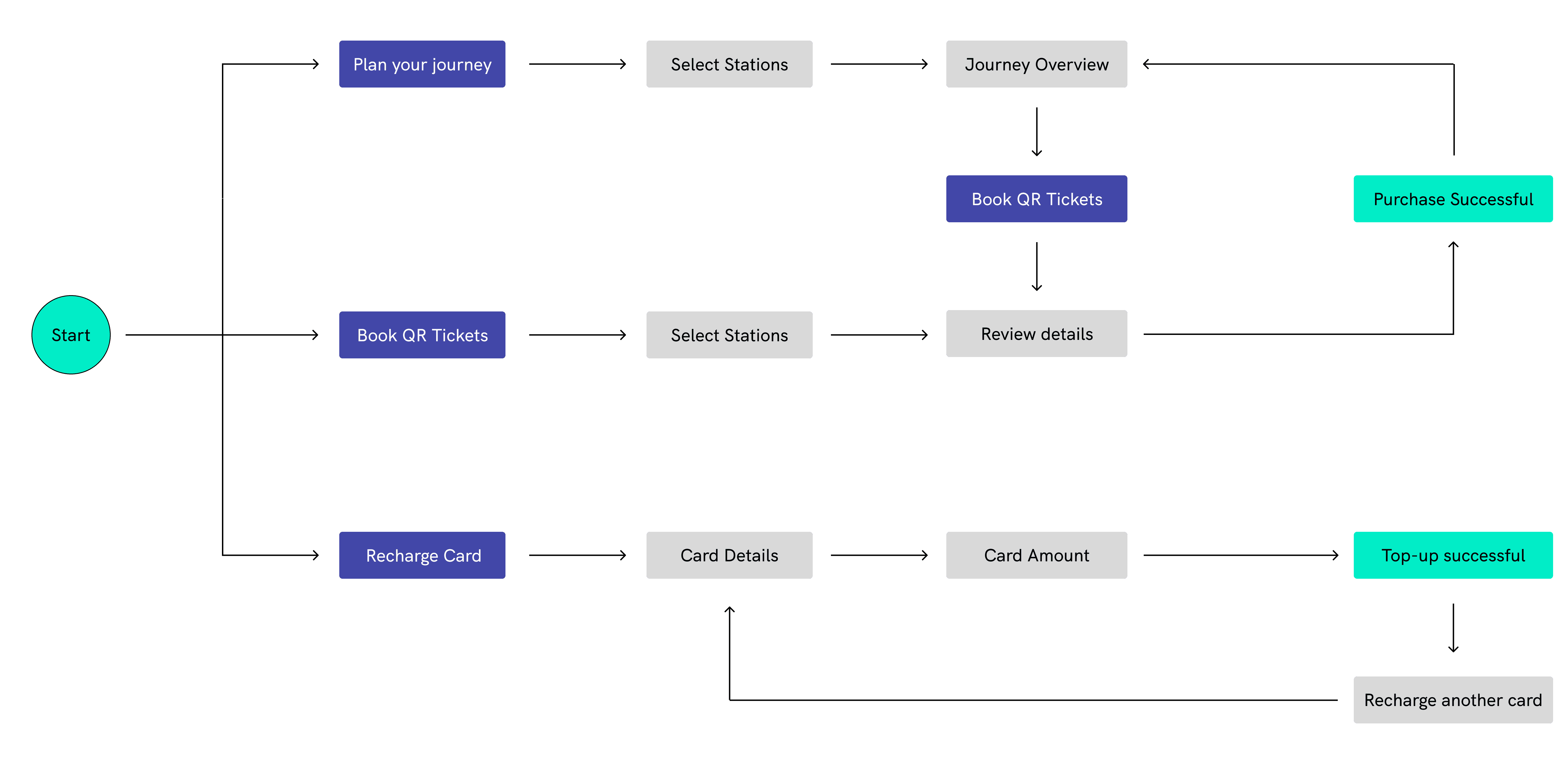
User Flow (for most important actions)
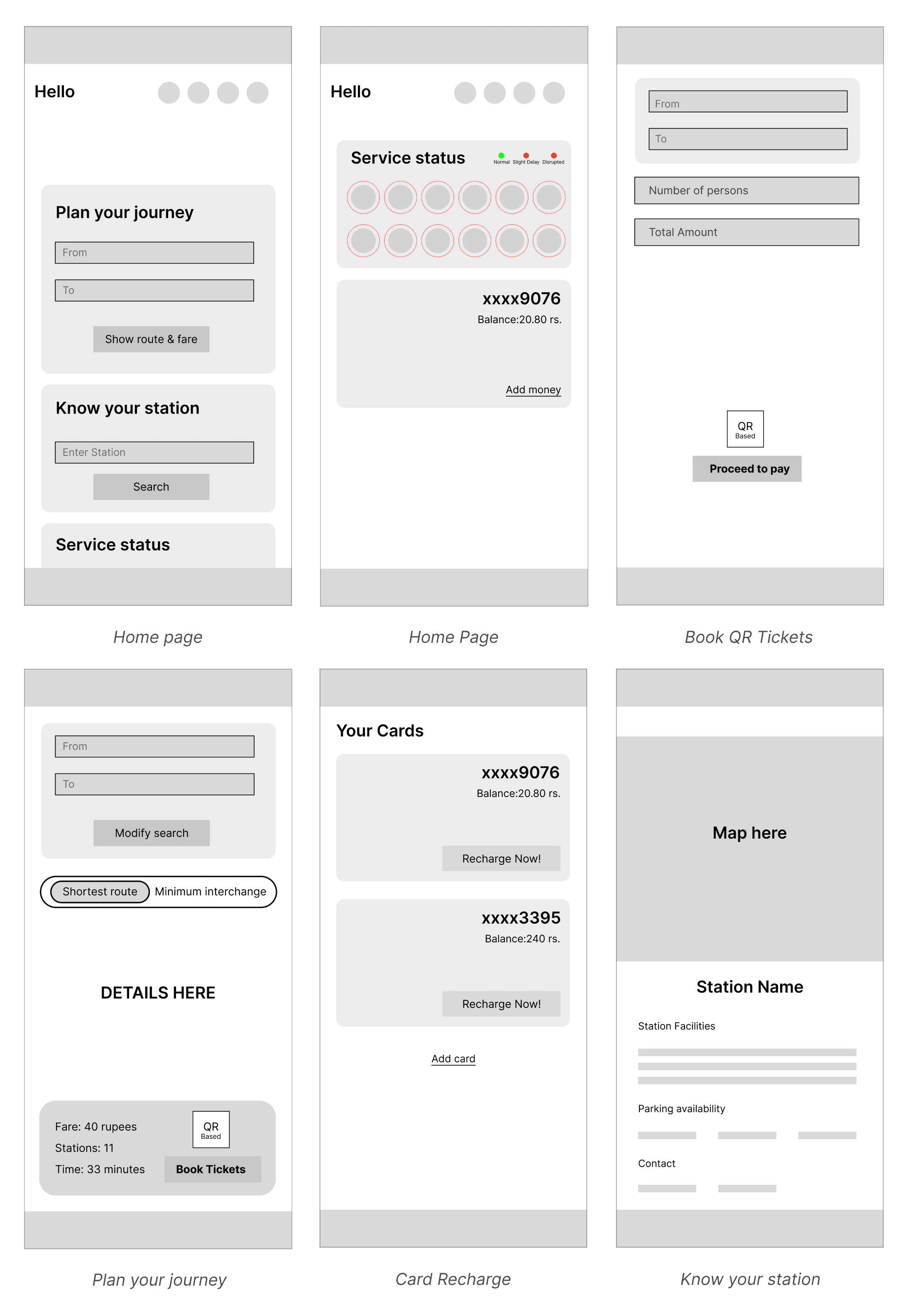
3. Wireframes
The basics
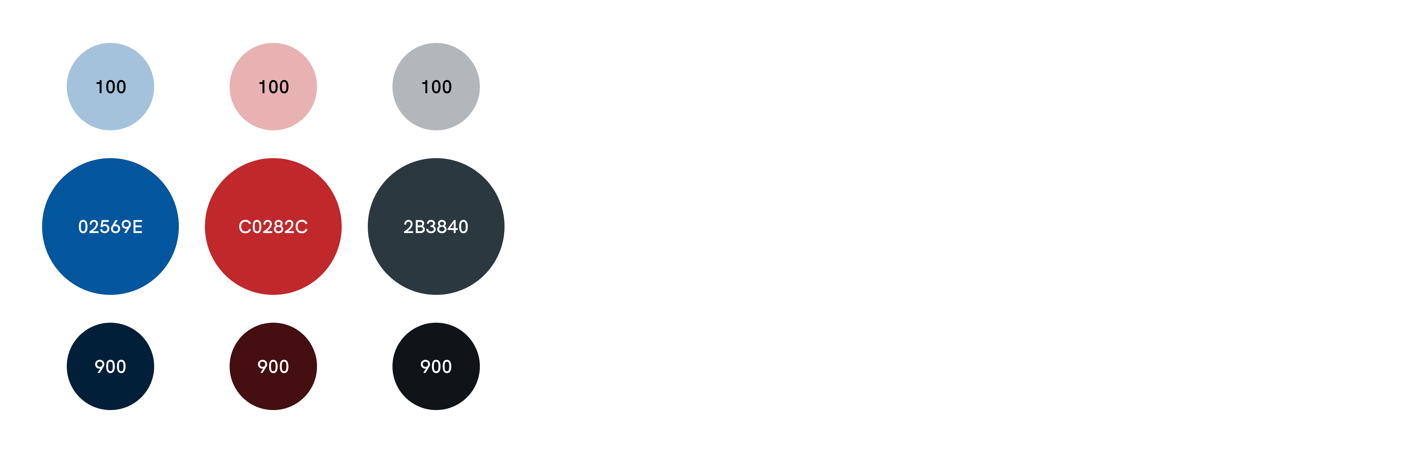
Color Palette: Used a consistent color scheme inspired by Delhi Metro's branding for familiarity.
Typography: Used Urbanist as my primary font - it has a highly legible look.
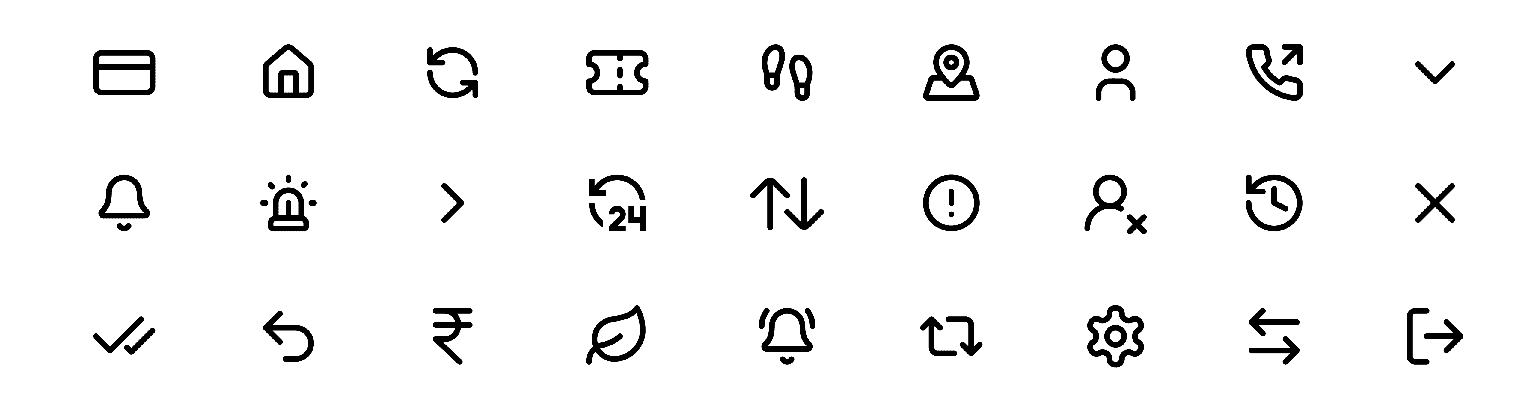
Iconography: Used Lucide Icons across the app - it has a well rounded and lightweight icon style.
Grid and Layout: Implemented a grid layout of 4 columns (Type-Stretch, Margin-24 and Gutter-16) and Rows (Auto, Height-8 and Gutter-8) to maintain alignment across different screen sizes. Ensured that all elements and spacing increment are set in multiples of 8 pixels.
High-Fidelity UI Design
Splash Screen Animation: First impression matters, so I designed an animated splash screen inspired by the Delhi Metro large network. The animation consists of nine lines (yellow, blue, magenta etc.).


Home screen animation: This is meant to enhance the first impression when opening the app. Designed in After Effects and exported using Lottie. A dedicated button - 'Change Line' allows users to switch color of the metro line (e.g., from Blue Line to Yellow or Pink).

Bottom navigation bar: The Home tab is a simple DMRC logo. Active tab is highlighted with yellow. Other inactive tabs are in white. Reason to use white and yellow colors is that they contrast with the deep blue background. Each icon is paired with a text label, ensuring clarity even for first-time users.

User Interface:
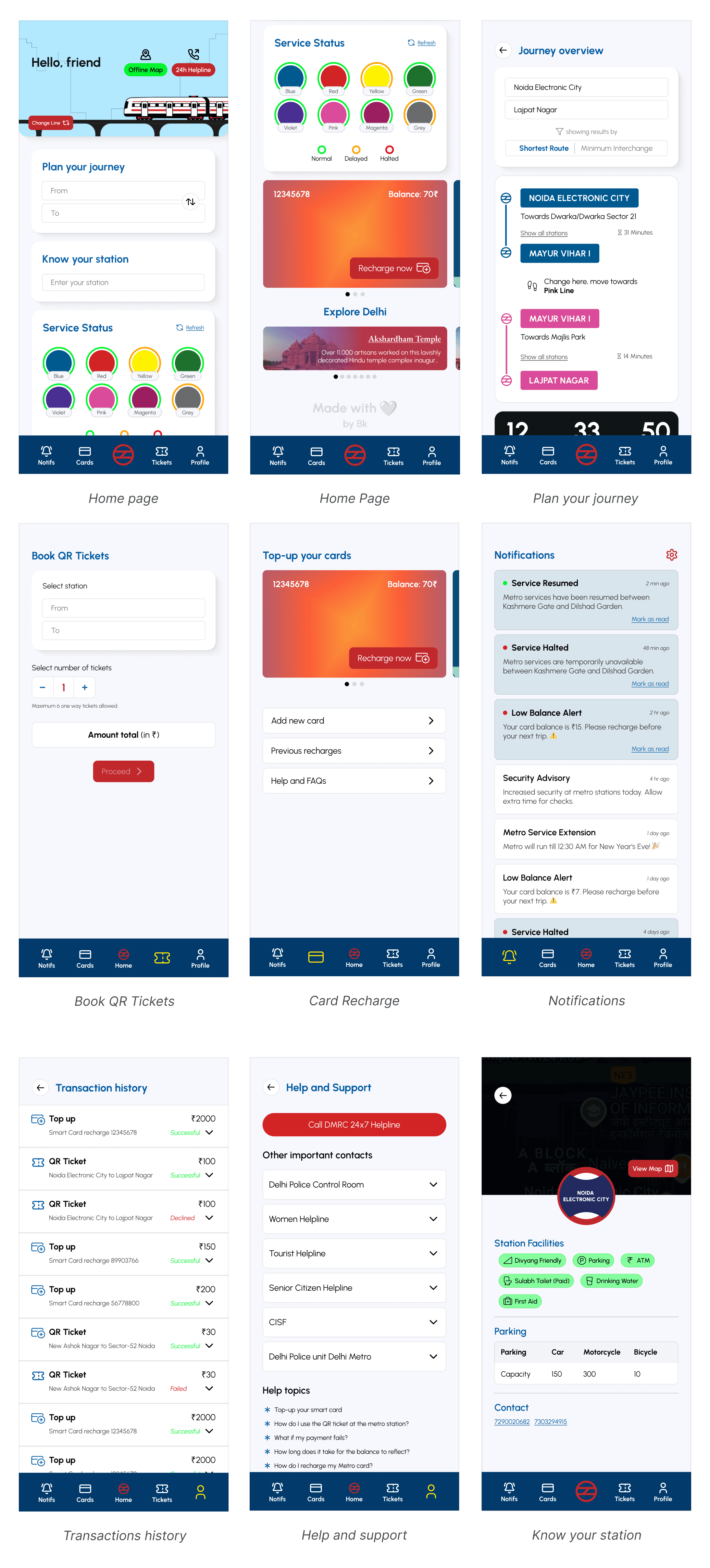
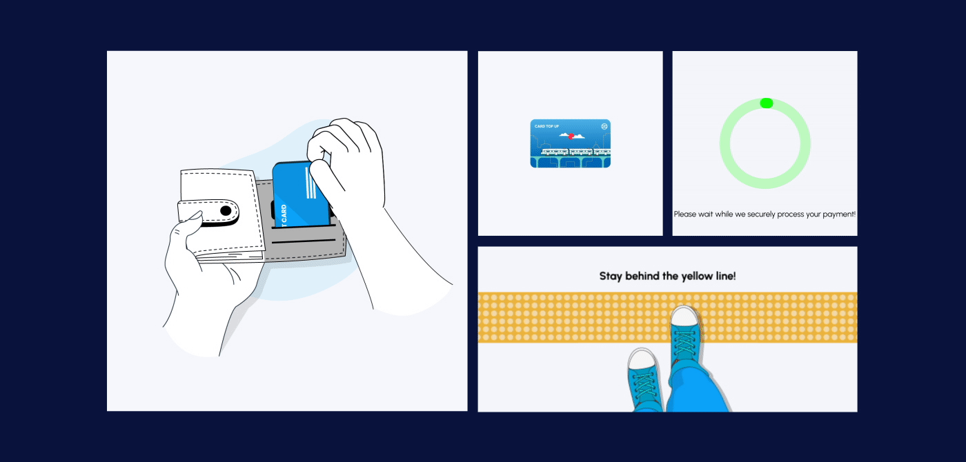
Micro-animations: Also incorporated subtle animations and micro-interactions to enhance the user experience.
Using Variables and Advanced Figma Techniques
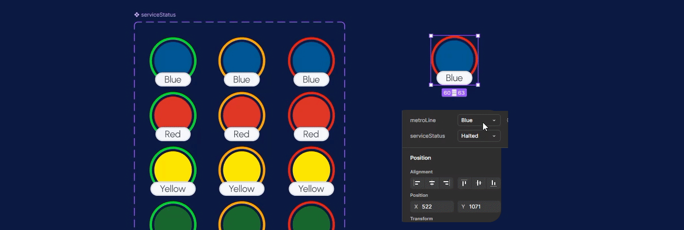
Component Properties: Created components with dynamic properties to reduce repetitive work and maintain consistency. For example, bottom navigation bar, metro cards stack, text input fields, cards, and overlays were designed with different states and properties.

Auto-layout & Constraints:

Variables, Conditional logic & advanced prototyping: (Yes, I purchased figma subscription for this). Used number variables for Card recharge amount (100,200,300,500,1000), Number of tickets (1,2,3,4,5,6) and price (50₹). Used Boolean variables in active/inactive states of buttons and String variables in cardholder's name.
I'll be able to better explain this if you call me for the interview xD
But this helps developers how to implement a certain design, also it helps simulate real-world interactions.

Check out the prototype
I built this app from scratch. It will be my utmost pleasure if you could spare five minutes of your day and go through the prototype once. (I hope) This redesign successfully prioritizes;
Enhanced UX: To access key features without spending too much time.
Improved Accessibility: The high-contrast color scheme ensures excellent visibility.
First time? Not a problem: The addition of text labels alongside icons makes navigation effortless, even for first-time users or those unfamiliar with modern apps.
Visually Minimal yet Functional: The simple, structured layout reduces cognitive load, allowing users to focus on essential actions without distractions.
Seamless application: The use of Figma variables, components, and prototyping techniques ensures a smooth, dynamic experience, close to a real world app.
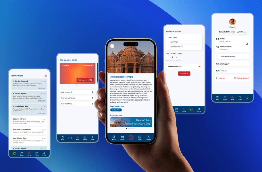
Explore the prototype or the before-and-after comparisons of key screens — Home, Book Ticket, and Plan Your Journey;
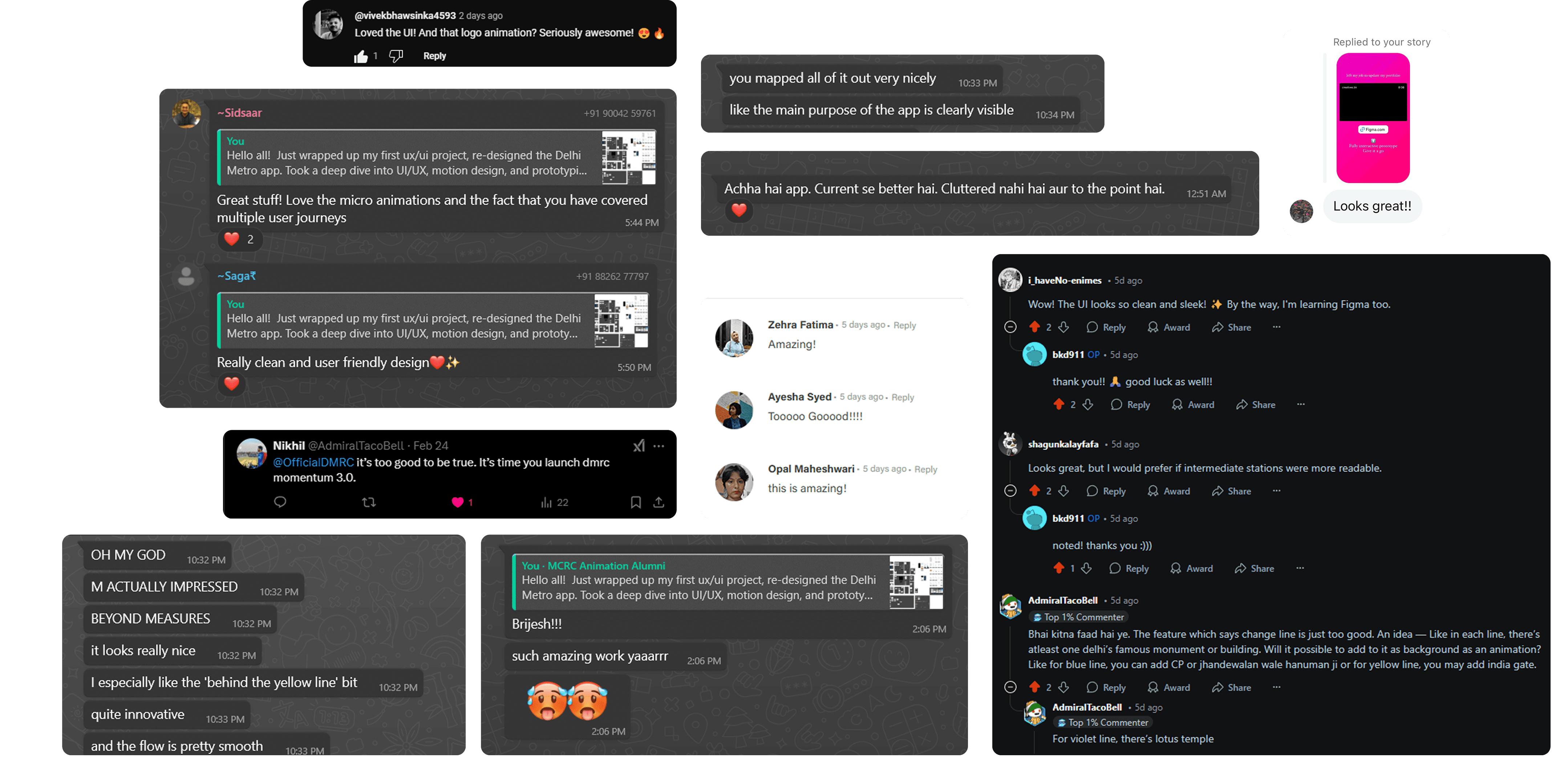
The redesigned DMRC Momentum app received overwhelming appreciation across multiple platforms, including Reddit, WhatsApp, Behance, Instagram, X and YouTube.
Many comments mentioned how visually pleasing the app looked, balancing functionality and design.
Users suggested incorporating Delhi landmarks into the app for a more immersive metro experience.